Showing posts with label Simon Tran. Show all posts

Thursday, 26 January 2012

Evaluation Q4: What have you learned from your audience feedback?

We uploaded our music video on Vimeo as we needed a place to share our video which allowed people to watch, rate and comment on. With this website, we was able to see how much plays and likes it got, along with people's opinion. Unfortunately we couldn't gather as much feedback on this site as an account was required but luckily I got the audience feedback in other ways such as interviews and questionnaires. According to the statistics, the video was more active at the end of January because there was a higher number of loads and plays.

Below shows the embedded video from Vimeo along with our statistics (click to enlarge):


Music Video Feedback

Interviewee #1

What did you like about the music video?
I liked the slow motion effect and green screen effect.

What didn't you like about it?
I didnt like the beginning when make up was used to create words because it was too light and couldnt see the end letter.


Interviewee #2

What do you like about the music video?
What I like about it is the way it's filmed and the way it went into 4 different boxes at some points.

What didn't you like about it?
What I dont like about it is that it was always in the same place, I think it should've been shot in different places aswel.


Interviewee #3

What do you like about the music video?
I liked the split shots and I liked the way they zoomed in on the house at the start. I liked how they moved apart from the sofa and when they were sitting on the stairs when ketchup goes on her shoe.

What didn't you like about it?
I think there should've been more variety of shots because some bits are repetitive.


Feedback for Music Video - Questionnaire Results


Feedback for Ancillary Products - Questionnaire Results
.


Music Video Analysis

After gathering feedback from both interviews and questionnaires, it is obvious that the audience had noticed each and every one of the effects we used. The most popular edit of ours which stood out towards the audience was most likely the box cut edit which ran throughout the music video. Our audience also noticed other effects such as the slow motion, green screen and zoom in effects. When watching the crowds reaction, it was clear that they found it quite humorous especially at the ketchup scene as they bursted out in laughter - we also see this in our Interviewee #2's reaction video. From analyzing my survey results, it showed that 100% of the people who took the survey said that the music video suited its genre which was a relief!

Like every music video, there is always constructive critism and feedback which I must take as it will benefit me in future. The comments that were consistently said were "there should've been more variety of shots", "different scenes" and "more locations". One of the major aspects which affected the music video was the performance of our artist as she lacked the energy and stayed still for a long period of time, this was noticed by 4 out of 6 people on my survey. Unfortunately the majority of the audience who took part in the survey rated it a 2/3 out of 5, which may seem a bit harsh but I wouldn't disagree as I now know what lowered the standards of my music video.

I now know what is required to gain or lose the audiences interests after acknowledging their point of view. It is quite obvious that there are lots of pro's and con's into why people like and dislike our music video. The feedback has definately helped me as the audience pointed out certain aspects which I didn't consider before filming the music video. If I had the chance to re-create the music video, I would guarantee that there would be a far better outcome at hand! I would definately consider having more locations, possibly outdoor too, so the audience wouldn't get bored of watching the repetitive scenes. I would also consider having our artist to perform better such as guiding her and telling her what to do such as dancing. Also different costume for different locations would be more interesting as one interviewee stated. Our filming could also improve in movement as our camera literally stayed still for the whole music video, I would most definately refilm this with camera movements to with the beat of the song to make the music video more lively. Overall I believe I did an okay job but if I had the chance to recreate it, it would be mind blowing thanks to the feedback. Other than that, I am quite happy with the outcome and the reaction from the audience as the target audience we were aiming at were mainly young teenage girls.


Ancillary Products Analysis

I obtained feedback for my ancillary products, the digipak and advertisement, through a survey and it showed more of a positive result than negative. Judging from the responses, it looks like the viewers enjoyed my ancillary products and each liked different aspects and effects. Some interviewees commented saying that it "literally looked like real products" and it was "very professional". Viewers also acknowledged the colour and theme used, especially the inner panel with the tiles of images. From looking at my results, it is clear that the viewer knew what genre it was out of the 5 different genres which proved that my ancillary products presented itself in the right category. Fortunately, the majority of the audience rated my ancillary products 4/5 out of 5! I was very pleased with this outcome.

I also gained some advice that the audience gave me which included the font choice, or typography work on the cover - this was commented by 3 out of 7 people. They also recommended to me that I could've used a better picture of her where she looked more professional and possibly more happy. I also managed to show the 2 versions of the advertisement poster and one of the interviewees said that they had prefered the original poster with the image tiles.

As a whole, the feedback were very useful to me because it showed me what was required to catch the audiences eye. The audience seem to like my ancillary product designs rather than dislike for many reasons so I am satisfied. But for the advice, I couldn't disagree with them nonetheless. If I was able to reproduce the digipak and advertisement poster, I would definitely take their comments into consideration. I absolutely agree about the font/typography comment as I used a rather basic type of font and barely applied any outstanding effects on it. I would also take high quality pictures with a white background instead of the usual photos with background interference which may affect the editing. Overall I think I done a brilliant job and I am proud of the outcome myself. The audience feedback was also positive in general as we were aiming at a young target audience.

Thursday, 12 January 2012

Evaluation Q1: In what ways does your media product use, develop or challenge forms and conventions of real media products?

We were influenced by a range of existing music products which we were able to gain initial ideas from. When researching, we had to make sure that we didn't copy the ideas exactly but to create the ideas in our own way. Our group looked and covered all aspects of a music video which included camera work, editing and mise en scene and had to consider what was and was not suitable for the genre of our artist.

Before starting our music video project, we researched conventions from Andrew Goodwin and Carol Vernallis's theories on music videos. When looking at music videos, we found that their theory was correct and that a majority of music videos had followed their ideas and conventions.

Our music video follows the following conventions:
  • Our video uses the artist both as narrator and as a character
  • Our artist often looks directly at the camera as an extension of performance to try involve the viewer
  • The use of jump cuts
  • A master shot (base track) is used to give the video a structure
  • Our video is repeatedly edited to the beat of the song
We were influenced by a range of different artists from editing, camera work and visuals. We also decided to challenge the conventions of the genre and tried to think outside the box by studying different genres.


          Jay Sean - 2012                                                   Reem X - Foundations


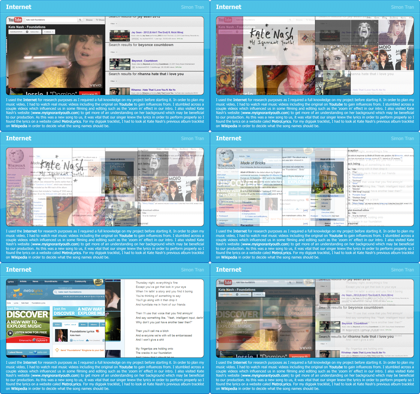
Jay Seans' video, 2012, has influenced us in editing because there is an effect which they use in the beginning where it zooms in from space to the building. We have also used this effect for our intro and zoomed from outside the house to the inside as shown below. When filming and editing this part, we encountered a problem as we took a still shot at first and were unable to make a zoom in effect on the editing software. Therefore we had to re-film this scene and zoomed in using the camera itself so that later on in the editing production we had to fade it smoothly into the next scene.


Beyonce - Countdown                                           Reem X - Foundations


Beyonces' new music video, Countdown, is packed with box-cut edits which influenced us in using the same kind of effect. This music video has used it as a motif and has created it effectively to suit the theme and colours of the video. We used this effect around 4 times for scenes such as the close ups of facial expressions and a scene with the beers.


    Rihanna - Hate That I Love You                                   Reem X - Foundations


Rihannas video, Hate That I Love You, is one of the many love songs that involve the artist inside a house, or their home as their location set. Although her song is a lot more deeper with feelings and emotions, we kept it at a similar location of our artist being at home.


Digipak
My digipak was inspired by the 2 album covers above as I grabbed different aspects for inspiration. Adele's album inspired me in many ways as her cover design is very simple yet effective, she is presented as an artist who is a serious musician and doesnt seek the male gaze. As our artist is similar, I got my artist to do a similar pose and then captured a close up of her. Pixie Lott's album was also an inspiration because she is also in the Pop genre and coincidently her album cover had a big X which could relate to my theme. Her use of colours such as hot pink and white really inspired me as it added a feminine touch towards the design.

Monday, 9 January 2012

Feedback for Music Video - Questionnaire

Feedback for Ancillary Products - Questionnaire

Final Ancillary Product - Advertisement

Final Ancillary Product - Digipak


Teachers Review & Feedback on Advertisement

Rebecca reviewed my advertisement poster and said that the tiles of images were too distractive on the poster as it draws attention from the actual information provided on the poster to be ignored. So I edited the photoshop file and removed the tiles but then encountered another problem as it looked too plain and empty on top and bottom. I then came to a conclusion to crop the poster size so that it was more narrow than before.

Before

After

Thursday, 5 January 2012

Using QuarkXPress

I used QuarkXPress to put together all my panels to form the digipak outside and inside as a whole. A 2 Panel CD Quark was provided.

Outer Panels

Inner Panels

Monday, 19 December 2011

Creating My Advertisement

Below are the steps I made through creating my advertisement poster.

1-4 - I wanted the consistency to keep running so I created the background for the poster to look similar to the inner panel of the digipak by applying the pattern, tiles and gradient.
5 - I added the front cover of the digipak on the left to show the viewer what we are advertising and put a faint version of the cover slightly tilted to give a creative effect so it doesn't look like it was just thrown on.
6 - I put on the title of the album which is Foundations and put a few hit singles which would be featured on the album underneath it as a subtitle.
7 - I created a badge with 'OUT NOW' on it as if it was a sticker notifying the release of the album.
8 - Since we were only allowed to pick either company reviews or tour dates, I decided to go with tour dates as it gives the viewer an insight of the quality of the album before going to any tours in the upcoming future.
9 - I included where the album would be available for purchases where consumers can buy from either in-stores or digitally.
10 - I finished the poster by adding our artist's website and our record label over a light rectangle box.

(Please click image to enlarge)

1                                                         2

3                                                         4

5                                                         6

 7                                                         8

 9                                                         10

Saturday, 17 December 2011

Creating My Digipak - CD Panel

Below are the steps I made through creating my CD panel for the digipak.


1 - I wanted to keep the consistency flowing so I used the background of the back cover as the inner panels background.
2 - I applied a light pink gradient over the pattern.
3 - I created a hot pink coloured CD template to cover the whole of the panel.
4 - I placed a 'X' or cross in the centre in a low opacity because that wasn't the main focus of the CD.
5 - I changed my idea from my mock up slightly by adding the name 'REEM' as individual letters in each end on the cross.
6 - I finished off by putting the title of the album which is 'Foundations' in an arc shape to fit with the round CD base, and kept the font colour white and full opacity because the title is the main focus.

(Please click image to enlarge)

1                                                         2

 3                                                         4

5                                                         6 

Friday, 16 December 2011

Creating My Digipak - Inner Panel

Below are the steps I made through creating my inner panel for the digipak.

1 - I wanted to keep the consistency flowing so I used the background of the back cover as the inner panels background.
2 - I created a tile of 8 images in 2 rows to create a collage-themed design, which was placed at the top of the panel.
3 - I repeated the step but this time I used different images and added them to the bottom of the panel.
4 - I focused on the center of the panel in which the audience will have their focus on so I decided to place an image of her there, undecided whether to keep her in colour or desaturated.
5 - I chose desaturated after some time and proceeded in adding two more images of her on the side.
6 - I finished off the inner panel by adding a light pink gradient to match the digipaks colour theme.

(Please click image to enlarge)

1                                                         2

3                                                         4

5                                                         6


Thursday, 15 December 2011

Creating My Digipak - Back Cover

Below are the steps I made through creating my back cover for the digipak.

1 - I first used the pattern which I created to form a background and also created a light radial gradient form the center.
2 - I wanted to present the track list in a unique way so I layered white text over a pink rectangle.
3 - I done this multiple numbers of times for each song and then tilted slightly over on another.
4 - I added the same border and faded rectangle from the front cover to keep the consistency.
5 - I added all of the copyright information, record label logos and barcode into the rectangle where the title of the cover was placed on the front.
6 - I finished off the back cover by adding a light pink gradient to match to front image.

(Please click image to enlarge)

1                                                         2

 3                                                         4

 5                                                         6

Creating My Digipak - Back Cover (Background)

Apart from the wallpaper pattern, I also thought about a wooden texture so I took one of my wooden floors from home:


Here's an edited version which I created to look more professional: