Tuesday, 29 November 2011

Analysis of Three Digipaks Relating To My Genre

Adele’s digipak has a very simple design. The picture used on the album cover of the singer creates strong connotations of femininity with her soft facial expression and little use of make-up which enhances her natural beauty. The choice of colour adds a sense of elegance as grey and white are very settle and graceful colours, which adds to her eleganc.  The album cover is able to introduce the sort of music which will be inside, through the peaceful appearance the buyer can assume that the music will be relaxed and calm. The font used is very clear and easy to read which will makes it stand out, they have used this font throughout the digipak which is very important as it continues the theme. Again the photograph used on the back conveys femininity but what is interesting is that they have exposed Adele’s natural beauty showing her in a positive light for females all around the world. This is something my group my want to take into consideration as we are trying to expose our artist as a serious musician and not someone who is trying to attract the male gaze.
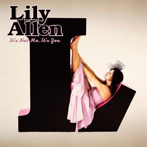
Lily Allen’s digipak is very bright and it works well in catching the buyer’s attention. The image is a wide shot which allows the audience to clearly see the all of the artist and her costume which is very important as it will tell the audience a little about the artist. The name of the artist is written in a black bold clear font and this will make it clear for the viewer and will catch their attention. The album name is again written in black however it is smaller which is a following the convention of digipaks, they have also used a different font which is more feminine. The bright colours used convey that the target audience would be teenagers and young adults as the colours are associated with femininity. The artist is being represented as quirky and fun which can suggest that her music will be on the same lines.  The back cover features a selection of random letters and numbers which is a recurring theme throughout the digipak. The letters have bright colour on them which emphasises the fun feel portrayed on the front cover. The artist’s website is featured on the back cover, allowing the viewer to find out more information about the artist. This digipak is very different to both Adele’s and Amy Macdonald’s as theirs are more plain and elegant as Lily Allen’s is more fun. As I am planning my digipak now I can consider taking in some of the playfulness of this digipak.

Amy Macdonald’s digipak is very simple and has a theme running throughout, which is done by the use of the same text font and colours. The picture that has been used on the album cover of the singer builds to the easy going theme of the album. The picture is close up of the female artist, it is very simple and her natural make up creates a sense of elegance and again adds to the theme of the digipak, the background has been blurred out which makes us focus on her. The simple design of the digipak that they have used introduces the artist and peaceful and relaxed which suggests that the music inside will be similar. The same font carries on throughout the digipak, the font itself is again very simple which is good at catching the attention of the buyer. The back of the digipak is simple and has all the conventional information normally put onto digipaks. Through this digipak Amy Macdonald comes across as serious and peaceful artist.

Importance and functions of Digipaks!

As we kow unlike CD cases Digipaks come with much more bonuses for example:-

  • More Graphics
  • Extra Information on the Artist or songs
  • Small Bio's
  • Thankyou notes
  • Pictures
  • Promotion Stickers
  • Autographs
All these things come together to serve a purpose that a normal cd case can't, the key word is PERSONAL, Having all these extra features are made to make the audience and fans buy the Digipaks so that they can feel like they are closer to their favourite icon and have something personal to them.

The price of a digipak is considerably more than a normal CD case however your getting more for value and it promots the artist even more.

DIGIPAKS DIGIPAKS DIGIPAKS!!

Finally moving on!, we're now moving on the the Digipak part of the course where we will be making and designing our own individual Digipaks for our artist! It should be fun.


What is a Digipak?


A Digipak unlike an album, is made up of panels, it holds the same function to sell the artist and the CD but is presented in a much different way. They can have up to 4-8 panels in one case and include many extra features compared to buying a normal album.


Some example are below!!


Personally i think Digipaks make Normal albums look ugly!

What I didn't like ?

I think I mentioned before that I thought it was a daunting having our artist constantly sitting on the step not doing anything physical, I think if we changed this aspect we could have maybe increased the performance of the music video.

I also didnt find the opening scene of the music video as appealing towards the end, it looked good in the beggining but then over editing and seeing it over and over again I found it to be tacky, probably just because I saw it too many times it was a good Idea initally though !

What I liked ?


What I liked ? I liked the use of our box cut editing within the video, through out the rough cut and final cut I always thought it was good an necessary, especially the bit with our fridge scene, it gives the scene some life and would have been boring if we done it from a normal point of view or single clip so I LIKE IT!

Additions that could have been made to the video

I think that for the genre we had which was indie/pop, more pop. We came at it at the right sort of angle, looking back now there are definatly some things that i think we could have improved on to the video for exampe, even though the performance by the artist we used was good, i think maybe having her just sitting on the step was a flaw, perhaps if she was walking around doing various activities may have been better to watch. However still GOOD JOB ! ! :)

Comparing Rough Cut and Final Cut


Above is the rough cut and the final edit to our music video, now we've finished everyhting spotting and naming comparisions between the 2 should be fairly easy and simple for example.

The lighting and colour has been enhanced greatly from the rough cut to the final edit, most shots and clips had to be improved on their brightness because there were very dark and gloomy and brand the video down the shots with the four boxes were the most important to get the lighting right because the background colours were essential.

We also cut our base tracks down because they became very long and repetitive after a while, watching any music video you dont want to become bored so we felt it was necessary to cut these, you can now see in our final cut that its much more precise and compact which is what we aimed for, we got rid of all the unecessary shots.

Monday, 28 November 2011

Practice Digipak

Today we got a chance to create a practice digipak cover provided with an image of the media teachers, Dan.


Researching Ancillary Products - Analyse 3 Digipaks

Since we are creating digipaks for our artist now, it is important to know what our designs must consist and how they must relate to the theme and genre.

As we made our own version of Kate Nash's original Foundations, it is clear that her digipak is one of many that links to our genre. Judging from her album, you can see that it looks surreal because she is looks like she's in her own little world with a big dolly-like house and garden.  The sky isnt real and looks like its been made from a gradient. One of the most noticeable aspects of this cover is the font used for the text which looks like a child's handwriting. The colour and the font is very consistent on her cover. From both the mise en scene and text, you can tell that the artist is very lively, playful and child-like.


Lenka's album cover has a similar mood to Kate Nash's because her one is also colourful and abstract. It looks very lively and seems like she's also a playful person. Although her background is plain white, the use of colourful shapes and images works really well to balance it all out, and to support the colours of her dress. Similar to Kate Nash, the font used for her front title isn't a professional and standard font but a font which is more free to represent herself. The designs are consistent in colours and font styles.


Katy Perry is within the same category as our artist, but unlike the two above, her album cover is more male gaze as she is literally exposing her whole body. Nonetheless, the cover and back works really well because the pink cloud has continued into one another. The main colours used for the text are blue and red to suit the mise en scene of the sky and clouds.


Researching Ancillary Products - Digipaks

Digipaks are a vital part of the music industry because  they are used to present as an album to reach out to the customer. Unlike a regular jewel case, digipaks come in book-style packaging which comes in either 4, 6 or even 8 panels! The function of a digipak is to catch the audiences eyes in order to gain higher chances of purchases and possibly new fans. The digipak design is very important because this is what the audience looks at, and the artist needs to know how to present themselves on the cover. In my opinion, I find that the cover has to also link to their music so the audience can get a sense of what genre their music may be.

Above is an example of a 6 panel digipak which shows the outside, inside, and disk. As we can see, everything is consistent throughout the whole digipak from text, colours and images.


Comparison between Rough Cut and Final Edit

From the pictures above it can clearly been seen that the lighting of the shots are very different. We achieved this progression by adding a filter called ‘colour collector’ which allowed us to change the balance and hue of the clip, I increased the white, mids and sat to make the clip brighter and decreased the blacks for the same reason. I think that this has helped for our music video to look better.                      
  ROUGH CUT

 FINAL MUSIC VIDEO


The beginning of our music was nowhere near finished in the rough cut, as after we had to film the zoom into the house which is now included in the final music video. There is a lot of parts we hadn’t finished when posting the rough cut, which is why there were random blank outs throughout. But after finishing them now I really do believe that this has helped to improve our music video.

Clearly when posting the rough cut we hadn’t filmed in the green screen, which explains why she’s singing to her hand. Now that we have completed this scene it looks a lot better and makes sense unlike in the rough cut.
ROUGH CUT

 FINAL MUSIC VIDEO


As our base track was way to recurring throughout the rough cut, we decided that we needed to cut the song as it was very long anyway. This has helped to make our video more interesting as in the rough cut it started to become boring after a while.

ROUGH CUT
 FINAL MUSIC VIDEO
Another clear difference is the ending, as in the rough cut it wasn’t yet completed. I think now that we have done this it has really helped to conclude our video and make it look finished. After adding the ending this also meant that we cut out some of the base track which is very good, as I have already mentioned that it’s a bit recurring.
ROUGH CUT
 FINAL MUSIC VIDEO

Importance and Function of Digipaks

A digipak adds value and is seen as something more special. It also tends to include more information about the band/artist, which makes their fans feel more closer to them. It’s seen as a modern approach to selling music. Digipaks are very important as they are what attracts the buyer, as the more they stand out the more someone will want to purchase it, however this may be done both at a store or through downloading. The cover art of the digipak can link to a significant style of the artist/band which will make it more unique. This will all help the music industry as it will help to earn the artist more popularity.
It is very important that when making our own digipak will try to make them as conventional as possible. We can do this by sticking to a typical digipak setup, having the artist name large and clear so it can stand out. It’s also very important that we include the name of our record label, web address, production information and a barcode. We have also been recommended to stick to 3 to 4 colours and to try and use one font throughout.

Practice Digipak

Firstly we had to create the images for our digipak in photshop. This is where all the effects are added to both the photos and the text if wanted.

We then import the image into Quark Express where we structured our digipak, as you can see below we we’re given an already made template.


After adding the image which I edited on photoshop I added the name of the artist and the song title.

After this I began the back of the digipak, where I put a blanc background as I didn’t want it to look to much. On top I added the track list, barcode and record label. I then went on to the add the production information.


Friday, 25 November 2011

Digipak Being Made


Digipaks


We will all be making our digipak’s for our artist individually. So I have started looking at some which I think are very good. Rihanna’s digipack for her album ‘Music of the Sun’ which came out in 2005 includes a medium shot of Rihanna in a skimpy outfit which consists of a bikini and an open dress over it. This is an expected look of an R&B artist, as females are likely  to wear sexy outfits which don’t cover much skin and appeal to males. The colouring of the digipack is the same throughout, the colours used are black and gold, and this creates rich feeling.
The photographs included are similar as she has the same clothing,  the photo on the right hand side is a medium low angle shot of Rihanna looking straight into the camera, as she is looking down this is portrays her as powerful. The other picture of Rihanna is another low angle shot, this picture shows Rihanna's body from a low angle so the reader can see Rihanna's body well, this picture is appealing to male gaze as she is not wearing much, On the bottom left picture there is three pictures of Rihanna's other albums, this will be promoting her other albums. Most of the image on the left is covered in white writing.The writing on the left hand side is a place where the owner of the album can read about some of Rihanna’s background and also about her albums and the story behind them.


This is another digipack for Rihanna but for another album, which is ‘Loud’ which came out in 2010. The front of the album is a close up of Rihanna and on the bottom is the title of the album, however her name is not included which suggests that she is so famous she doesn’t have to include her name. On the right hand side is the back of the digipak which includes the names of her songs and another picture of her, however this is long medium shot which shows most of her body. The colours used in the digipak are red, gold, black and white all these colours portray the idea of wealth, like I said for the other digipak this is very common with R&B artists. The digipak also includes promotional images which are taken at the scene of her music video ‘Only Girl In The World’.

Banned Album Covers


Cannibal Corpse (Butched at Birth)
This is the album cover to the American death metal band Cannibal Corpse, this is their second album and it was banned in Germany until June 2006. The very disguising and grotesque cover art features a slaughtered mother to be being butchered by a zombie and also her baby about to be slaughtered by another zombie.


Kanye West (My Beautiful Dark Twisted Fantasy)
This album was rejected by certain stores because of the provocative cover art. The album cover shows Kanye West being straddled by an armless winged female (a phoenix), both of them are depicted nude. The artist who created the cover art said that Kanye wanted the cover image to be banned.

The Beatles (Yesterday and Today)
The album cover is a photograph of the band smiling while being surrounded by dead babies. This wasn’t intended to be used as the album cover, but it was Paul McCartney who pushed strongly for the photo to be used at the album cover, he described it as ‘our comment to the war’. Capitol initially ordered plant managers to destroy the covers, but when faced with so many already printed, he decided to instead paste a much more conventional cover over the old ones. The new cover featured the band posed around an open steamer trunk.

Original Digipak

After looking at Kate Nash’s original digipack I can tell that mine will be very different. As hers doesn’t focus on her very much as she is very little, in my own I think that there won’t be much background and she will appear bigger. I like the font they have used as its silly which represents the artist as playful and nice.

Inspirational Album Covers

As our song ‘Foundations’ by Kate Nash is a indie song, it attracts more females that males. The theme of our song is a break-up, as our artist is breaking up with her useless boyfriend. Similar artists will include Lily Allen, Adele, Michelle Featherstoneas they are not made to seen as eye candy to the viewers eyes. Below are their album covers, which I believe can inspire us in making similar ones for our artist.


Social Networking Sites


Social networking sites allow us to be very open and with just the internet alone our music video could be seen by millions of viewers. We could upload our video to a variety of networking sites like youtube, twitter, facebook, tumblr and vimeo. As all these sites can be accessed worldwide this means we can get our music video viral. This would also allow us to get feedback and we can see what people thought about our music video. Using the internet allows us as viewers to watch video’s from all around the world, and we don’t have to worry about waiting for it to come out in our country. Artists who publish their music on networking sites gain a lot of publicity and this will reach out to their audience and people will want to buy their music on itunes. Many artists also get famous from such sites, for example Justin Bieber who started uploading songs on youtube is now a famous singer, and also our artist Kate Nash who first started posting her songs on myspace which has also led her to become famous.

Album Covers


An album cover is at the front of the packaging of a commercially released audio record. It is what the buyer first sees, which is why it has to be eye catching. Here are some album covers which I particularly like.  


I think both of these album covers are very good, as they work well in selling the artist in the way they want to be viewed. They are both very different as J.Cole’s one is a wide shot where his whole body is seen, unlike Rihanna’s where it’s a close up of her face. They both also display different messages as J.Cole is in what looks like a locker room, and he has a very serious facial impression we can expect for most of his songs to be serious. This is contrasted with Rihanna’s album cover where she is made to look wild and out of control which tells us that her songs are going to a bit extreme too.

What We Should Have Done Differently

I know that our music video is now finished and posted but if we could do it again there are a number of things which I think we should have done differently. Most obviously I believe that we should have filmed a wider variety of shots as our base track is very recurring throughout our whole music video which I think may bore our audience. Also I think that we should have involved a tracking shot as this would make our music video look more interesting and it wouldn’t involve our artist to do much but walk. As our actors are very static if we could film again we would definitely instruct them to move about a little as the stillness makes our music video a little boring as not much really happens. However I believe that with the footage we had our editing is quite good, as there wasn’t much more we could do.

What I Did Like

Our music video isn’t all bad there are some particular things I do like about it. Firstly now that we have edited the light I think our music video looks more clear and professional, as before the dark lighting made it look dull. I also think it was a good idea that we filmed our base track from different angles as even though it goes on quite a lot it is a good thing that at least we have included different angles which makes the video look better. Thirdly I also like the split editing with both the fridge scene and the different faces. I think this adds to our music video as it makes it look more fun and interesting which is exactly what we needed. In my previous post I mentioned how our shots were very static but our genre didn’t give us much flexibility as we couldn’t really include dancing or a lot of moving about, so therefore in a way I think we have done quite a good job with the song that we choose. I also think that the beginning of our video is good as it introduces the artist and grabs the audience’s attention.

What I Didnt Like

There are a lot of things that I personally don’t like about our music video. Firstly I believe that we didn’t get a variety of shots, so we had to use our base track most of the time which I think makes our music video a bit boring. Also the fact that they are static shots makes it even more dull as nothing really goes on in the clips. Secondly looking at our storyboard there is a lot of things we didn’t end up involving into our music video, which I believe our video could have benefited from for example the beginning where we planned to include a calendar, this would have set up our music video as an illustrative one from the beginning. Another thing I also don’t like is the scene where he is standing on her hand for the simple reason that that he looks to dark, as when filming on the green screen in was really hard to get the light perfect without creating shadows, and after editing the light of music video he looks even darker. Also the fact that our actors hand moves a little and he’s feet stay in the same place makes the scene look unprofessional.

Cinema Screening

We are going to a cinema on December the 6th to see all of our music video, this a time where we can receive feedback and also see everyone’s opinion on our music video. I believe this will be a good experience for everyone as we can all see how people got on and what they created. I think this will be good time to really see what we have produced because seeing it on the big screen will be much clearer than on a computer screen. This will help us to see where have gone wrong so next time we have the opportunity to create a music video we will be more prepared and skilful.

Final Music Video

Thursday, 24 November 2011

Editing Our Music Video 6


Unfortunately after posting our music video on blogger yesterday I realised there is a bit where the clips jump, so today we had to go in order to fix this. I believe that now we are completely finished with our music video. In the clip above you can see where the error was made, and we have now posted our final music video.

Editing Our Music Video 5

Today was our final day of editing, we have now completed our music video. We only had a little to do as most of it was done. We deleted the scene where the pictures pile up as we believed that it didn’t look realistic. As there was so much of the base track just going on we also
included some split screen editing in order to make it look more interesting.

We also changed the lighting of our clips to make them brighter and more clear. I believe that this has definitely contributed in making our video look better as now the clips their selves look nicer.


As we have now finished our music video we had to upload it onto blogger, so we had to use the new programme as handbreak isn’t working any more in order to do this.

Wednesday, 23 November 2011

Simular Edits 2


When planning our music video we had a plan to have pictures piling up and then one of them comes to life and enlarges. However after beginning this edit on Monday, I personally don’t really like it as it doesn’t look realistic this is because we haven’t used real pictures but we have done it all on final cut. If my group don’t feel the same way then we can carry on with this edit, but I feel that it doesn’t look good and it will not contribute towards making our music video look professional.

Editing 5

Another day of editing today, we’ve now finished the majority of our music video. Today we didn’t have a lesson so we went to the workshop at lunch and continued after that too. We have now completed the green screen edit where our actor will be standing on our artist’s hand. Personally I don’t believe this turned as well as it could have as the shot is very dark, but it’s too late to re-do it now so we will have to stick with it. Rebecca printed out a sheet for me to follow and helped me in order to successfully edit the scene involving the green screen.

Today we also completed the ending of our music video, we may edit it a little but we have the overall structure done. There are only a few things left to do but we there’s little time so we might have to stay after our lesson tomorrow so that we can complete it.

Tuesday, 22 November 2011

Green Screen

We have now completed all of our filming! Today we filmed on the green screen which was very difficult. We thought that it would be simple and easy however this is not how it happened. When setting up the lights for the green screen we couldn’t allow any shadow which was very hard as we had to have enough light in order for the green screen to actually work.

It was especially hard because we had to get his whole body in so that when we edit it he can be standing on her hand.  We also decided to use some extra lights to make the shadows disappear and to also light the scene better. Hopefully this has worked and it will all go to plan, we will find out tomorrow when we have to edit it.

Monday, 21 November 2011

Editing Our Music Video 4

Today we continued with editing our music video, we also stayed behind after our lesson in the lunch workshop so we can get more work done. After our rough cut we can now see what we have left to do and are more planned in order to get it done quicker. We imported new footage from filming the zoom of the house, and have edited it so it flows with the shot of the actors. We have also completed our base track as we was told some clips went on for a while, so today we had to cut them which has made our video look better.


We have also began editing the picture pile up, where a number of still shots will appear on the screen and one of them will start playing and also get bigger at the same time, we are still in the process of completing this. Below you can see print screens of the edit.


Today we also edited the sofa scene where they will move away from each other in a jerky and jumpy way, this edit will hopefully make our music video look more interesting as most of our video is quite slow as it goes with the genre of the song.
Tomorrow we are planning to film our final footage on the green screen, which will be put into the clip where our actor is holding the man in her hand, hopefully this all goes to plan.